

Camera Lens Testing
Part 6 - Lens Testing for Resolution, Chromatic Aberration and Distortion
Probably the most frequent complaint or cause for concern about a lens is that it's not sharp, but what does that mean? Well, unless you're shooting a static subject with the camera and lens on a tripod, it probably doesn't mean much. A lot of photographers don't realize that hand holding a camera (even if it or the lens has image stabilization), isn't the way to get the maximum possible sharpness. If the shutter speed is high enough and your hands are steady enough, you may get a critically sharp image, but don't bet on it happening every time.
So you have the camera on a tripod, what's next. Well, you have to be sure that the lens is focusing properly. To do that you have to do some focus testing as I described in the article HERE. Assuming you have a camera and lens in good calibration and you are getting an accurate indication of focus by the AF system, then what?
At this point you have to decide just how much effort you want to put into measuring the optical characteristics of your lens. If you want to go all the way, I'd recommend you look at the Imatest package. It's currently (2013) $299 for the "lite" version and $2200 for the pro version (though a limited free trial edition is available). I won't go into details of it here since you can find everything you'd ever need to know on their website. It can give you a lot of technical information on an lens (if you do the tests right) and it's an excellent package, but even the "lite" version is pretty complex and more than most people want to deal with. If you want something to do lens testing that's a little quicker and easier (and much cheaper) then you can do some simpler tests using a test chart as described below.
The lens testing chart I'm going to use can be printed on 4x6 card. Now a 4x6 target isn't very big, so the idea is to print a number of them and place them in the center and at the corners of a larger chart. For APS-C sensor cameras I usually place them on a 15"x22" background and if that fills the frame, the magnification of the system will be around 1:25 which for a number of reasons is a good number to show the typical performance of a lens. If you were doing lens testing using a full frame DSLR, you'd put the targets at the center and corners of a 24" x 36" rectangle to get the same magnification ratio. The target itself is shown below:
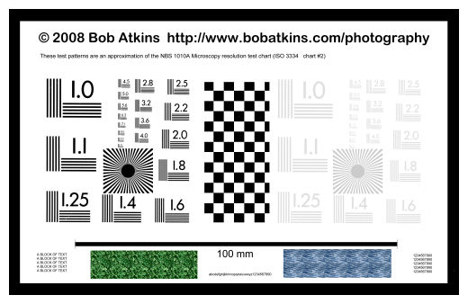
You can download a high resolution printable version of this image (as a Zipped JPEG) via THIS LINK.
With the lens testing target printed on glossy paper, most printers should be capable of printing a good quality target when set to their maximum quality settings. The lines in the test patterns should be well resolved down to at least the 5.0 lp/mm line set. If the target is used at the intended distance, you won't be using anything past the 2.8 or maybe 3.2 line sets anyway.
The lens testing resolution patterns are based on those used for the NBS 1010A test chart. There's a high contrast set on the left of center and a low contrast set on the right of center. In the center is a checkerboard pattern which is used for focusing. Within the resolution patterns on each side is a Siemens star pattern. Below the test patterns is a line which is exactly 100mm long that can be used for calibration as described later. There are also a small texture patches and text blocks on the left and right at the foot of the chart which can be used for visual assessment of image quality. A black border is used to look for chromatic aberration as will also be described later.
s.jpg)
Version 2 of the chart
UPDATE:I've updated the chart to make it more useful. I found that in testing I rarely used the low contrast resolution pattern on the right side of the chart so I replaced it with a sine Siemens star pattern with small text in the center. In the printed chart and in the full size file the star lines go all the way to the white center disk. The pattern you see here on the page is a consequence of downsampling the image to 600 pixels wide. The original is 6600 pixels wide. The sine version has smoother black to white transitions than the square wave version on the left. In place of the texture patterns (which I also didn't find useful) I put a sine wave logarithmic horizontal resolution target on the right, two concentric circle patterns (at 1.8 lp/mm and 2.8 lp/mm) and two grey patches (useful for looking at image noise), one at RGB 128 and one at RGB 192. There's also a grey scale test strip at the top right RGB values 0, 64, 128, 192, 230). The 2.8 concentric circle doesn't look like concentric circles in the image above, but it does on the printed version. The image above is again showing the effect of downsizing to 600 pixels wide, at which size the circles are not resolved.
You can download version 2 of the resolution test chart as a zipped jpeg file.
Below is a typical lens test setup. In this case the 4x6 charts are attached to a sheet of white pegboard (about $5 from Home Depot!). The white background is good and the regularly spaced holes provide both distance calibration and can be used for visual assessment of lens distortion and camera alignment.
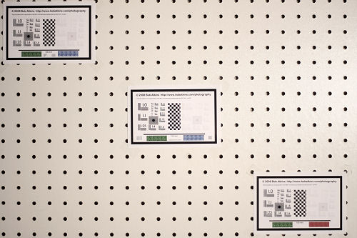
Three lens testing charts are used here, but you can put one at each corner if you want, and the charts can be rotated if you wish. In this case the corner charts are placed at the corners of a 15" x 22" rectangle. As noted above, this fills the frame of an APS-C DSLR, the magnification ratio is approximately 1:25. For a full frame DSLR (or SLR) use a 24" x 36" rectangle.
Distortion
If you use a background with a regular rectangular grid pattern, such as the white pegboard suggested above, you can use that pattern to assess the degree of distortion of the lens. Notice that in the image above the holes line up in a very straight line along the edges of this image showing the lens (EF 50/1.8) has very low distortion.
Shooting the lens testing chart
Use a tripod. I don't care how steady your hands are or whether or not you have image stabilization, if you want accurate and reproducible results, you need a tripod. A cable release doesn't hurt either, especially if you are testing a long lens and/or your shutter speed is slow. You can even use MLU (Mirror Lock Up) if you have it and want to be certain that camera movement isn't affecting sharpness, though MLU probably isn't necessary with lenses shorter than 100mm.
Set the height of the tripod so that the center of the lens is level with the center of the chart. The move the camera away from the chart until the 15" x 22" area just fits in the viewfinder. Now make sure your camera is square on to the chart. Set up your lighting (if you're doing this indoors), adjust your white balance and take an exposure reading from a gray card. If you don't have a gray card and you're using a white background as in the example above, just set your exposure compensation to about +1.5 stops. That should make the whites white rather than a mid gray.
It's very important to get the alignment of the camera/lens and chart right. There are three things to align:
- The plane of the sensor must be parallel to the chart
- The optical axis of the lens must intersect the center of the chart
- The horizontal/vertical axes of the sensor must align with the horizontal/vertical axes of the chart
There are a number of ways to ensure alignment, here's one of them:
Take a long, straight, thin rod and mount it so that it sticks out of the center of the chart at right angles. You can set this up geometric ally using a T-square. Then when you view the chart, only the tip of the rod should be visible. If you can see any of the sides of the rod, the alignment is off. If you can see only the tip, then conditions #1 and #2 of the above list have been met. To meet condition #3 you just need to rotate the lens until the sides of the viewfinder are parallel to the sides of the chart. If not quite parallel (due to distortion), then then the left and right and top and bottom gaps should be symmetrical.
Any uniform illumination source is OK, as long as the lighting is truly uniform. Shooting outdoors in daylight would be ideal, but you can also shoot indoors with diffused artificial light. You can use flash, fluorescent of incandescent lighting. Again, just make sure the illumination is uniform and you're not getting reflections from the test targets (which means that using on-camera flash isn't a good idea).
For most lenses you'll want to shoot the first image at maximum aperture, then a series of shots stopping down by 1 stop for each one. So for an f2.8 lens, shoot at f2.8, f4, f5.6, f8 etc. Past f8 you'll probably start to see some drop in sharpness due to diffraction effects.
If you know your AF is good, you can use AF. If you're not sure, compare a few manual focus shots with autofocus, or do an autofocus test as described HERE. Select the "one shot" AF mode and use the center AF zone only. If you want to make absolutely certain that all the shots use the exact same focus setting, you can focus the lens using AF, the switch to manual focus. If your camera has a "Live View" option, use it. For manual focus it will show you exactly when the image is in best focus with no ambiguity. A viewfinder screen has to be perfectly aligned to show best focus, but the same sensor is used for Live View manual focus as for the actual image, so if one is in focus, so will the other be in focus. Most cameras provide for a magnified live view image for even better focus accuracy.
Analyzing Lens Testing Chart Images
The images you shoot can be analyzed for sharpness and chromatic aberration quite easily. The numbers on the lens testing chart represent the line pairs per mm (lp/mm) values of the test patterns they are next to. These patterns should be pretty accurate down to the set marked 5.0. Past that set, most printers can't really generate accurate patterns, but we're not going to need them anyway.
To find the resolution on the sensor we need to know the magnification. For example if the magnification is 1/26 (1:26) and the line set at 2.5 lp/mm is resolved in the image, that really corresponds to a resolution of 26x that on the sensor, i.e. 2.5 x 26 = 65 lp/mm. There are three ways to determine the magnification. Note that resolution can only be determined in steps of about 12%. If the 2.5 lp/mm group is resolved the resulting calculated resolution is 65 lp/mm. The next group (2.8 lp/mm) corresponds to 73 lp/mm. So you get 65 or 73 lp/mm. You can't really get anything in between from this chart.
- If you're using a pegboard background with 1" spacing between the holes, you can just count the number of hole to hole spaces across the image. If you count 22.5, the image is of an area 22.5" wide, which is 571.5mm. Divide this by the actual width of your image sensor. For an EOS 40D this is 22.2mm. So you divide 571.5 by 22.2 to get the magnification factor, which in this case would be 25.75x
- You can also measure the length of the 100mm line on the chart in pixels. Let's say you find the line is 670 pixels long. With an EOS 40D we know the sensor is 22.2mm wide and contains 3888 pixels across the width. Therefore the image of the 100mm line on the sensor must be (670/3888) * 22.2mm = 3.825mm. The magnification factor is therefore 100/3.825 = 26.14x
- If you have the corners of the 15"x22" area at the corners of the frame, the magnification will be around 26x. This is approximate, but probably good enough!
So now look at the image at 100% in an image editor and see which is the finest set of line patterns which are resolved. Let's say you can see the 2.5 lp/mm set is resolved, but the 2.8 lp/mm set isn't. Let's say you determined your magnification factor to be 26x. The resolution at the sensor would be 2.5 x 26 = 65 lp/mm.
Now the problem here is that the sensor is limiting the resolution. For example, the EOS 40D sensor has a pixel spacing of 5.71 microns so there are 175 pixels per mm. There's a theorem in information theory called the Nyquist sampling theorem, which says that in order to reconstruct a sine wave you must sample at at least twice the frequency of the sine wave. If you were to assume that the same principle applies to line pattern charts, the very best you could do would be to resolve about 87.5 lp/mm with a sensor which has 175 pixels/mm. However you can't strictly apply the Nyquist theorem for a number of reasons. First there's an anti-aliasing filter over the sensor which cuts off response close to the Nyquist limit to eliminate spurious effects such as moire patterns on images of closely spaced lines. Even without the anti-aliasing filter, you're not looking at reconstructing sine waves. You're looking at bar patterns with higher frequency components. So you're not ever going to get 87.5 lp/mm resolution, no matter how good the lens is.
The basic upshot of all this is that even with an EOS 40D sensor (which incidentally has about the same pixel pitch and therefore resolution as the fill frame 22MP EOS 1Ds MkIII), you're not going to see more than about 75 lp/mm resolved. Since most lenses are capable of resolving quite a lot more than 75 lp/mm, this in turn this means that most lenses will give you the same resolution based on these chart measurements, even used wide open. Now this doesn't mean that all lenses are equally good at all apertures. What it means is that strict resolution measurements aren't the best measurement of lens quality. So why measure it? Well, if you don't see a resolution of over 60 lp/mm in the center of the image, you know you either have a really bad lens, a really bad sample or a lens or a focus problem. In the image corners you may see lower numbers, especially from low cost zoom lenses.
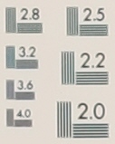
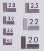 On the left is a 100% crop from a test image. You can see the 2.5 lp/mm line set is quite well resolved. In fact even the 2.8 lp/mm set is just resolved. For this particular image a magnification factor of 26.3 was measured, so here we're seeing a resolution of 2.8 x 26.3 = 73 lp/mm. Incidentally, this shot was taken using a Canon EF 50/1.8 lens at an aperture of f5.6. If you see something like this, there's nothing at all wrong with your lens. With an 8MP sensor APS-C DSLR you may see slightly lower resolution and with a 12MP APS-C DSLR you may see slightly higher resolution, but the difference will likely be quite small. On the left is a 100% crop from an image shot with a 12MP Sony Alpha 700 using a 100/2.8 macro lens at f5.6.
What makes a good lens better than a poor lens then, if the digital images they produce all have similar center resolution? The answer is contrast, or more specifically MTF (modulation transfer function) at resolutions less then the theoretical limit. For an explanation of MTF see the MTF and SQF article on this website. Higher contrast (MTF) will result in images which look sharper, and will in fact contain more information. That's why these charts have a high and low contrast set of patterns. Better lenses will better show finer detail in the low contrast patterns than poor lenses will and so may give a better indication of a better lens.
 There are also samples of text and patterns (grass and waves) along the bottom of the chart. These can also be used to make a visual assessment of the lens. With the charts shot at the design magnification factor of about 25-26x, the smaller text should be on the limit of readability. On the left is a 100% crop taken from a test chart of the text block at the lower left.
 Chromatic aberration will show up most on the sides of the black border lines of the chart in the corner of the image. If you see one color on one side of the line and a different color on the other, you're seeing chromatic aberration. On the left is a sample from the corner of an image shot with a Canon EF-S 18-55/3.5-5.6 lens at 50mm and f5.6. You can see a purple fringe on the right side of the line and a yellow fringe on the left, which indicates the presence of chromatic aberration. The more intense the colors and the wider the color bands are, the worse the aberration is. I'd say this amount chromatic aberration is noticeable, but quite acceptable for a low cost consumer zoom.
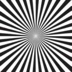 The Siemens star pattern, particularly the high contrast version on the left of the chart can tell you all
sorts of things and may be the most useful single element of the chart for visual assessment of the image quality. This is a pattern consisting of alternating black and white thin "pie shaped" segments. As you move towards the center of the star the lines get closer and closer together. The higher the resolution of the system generating the star pattern, the closer to the center of the star they will appear to merge. Below are actual siemens star images taken using an EOS 40D and an EF 50/1.8 lens at apertures of f16 (left) and f5.6 (right).
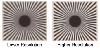
The image on the left was taken at f16 and is softened due to the effects of diffraction. The image on the right was taken at f5.6, probably one of the sharpest aperture settings for this lens. As you can see, the lines are visible closer to the center of the star in the higher resolution image on the right. You can also see some patterning close to the center disk. This is caused by interaction of high frequency components of the image (high lens resolution) with the sampling pattern of the pixels. In the image on the left there are no such patterns because there are no such high frequency components in the image. The lines are akin to Moire patterns.

The star patterns above show what happens when focus shifts. On the left the image is focused and each image to the right shows what happens when focus is shifted by approximately 0.5, 1 and 1.5 times the total lens DOF. You can see rings of apparent sharpness in the star image on the extreme right (blurred in the center, then a ring of sharpness, then a blurred ring). This is a classic indication of optical phase reversal which occurs under defocus conditions.
